Introduction to Stock Market Indicators
Stock market indicators are obtained by taking market data and manipulating it in an attempt to learn more about the strength of a stock.
Bulls and bears are used to describe the up and down of the market. A bull tends to use its horns to lift oncoming threats out of
the way and raises them into the air which is the direction of a bull market. Bears
tend to come down on you from above hence they represent a bearish market or
one that is falling.
The above desk figurines depict the back and forth of the market as it unpredictably tends to move in a preferred direction. They make good gifts for traders, stock brokers or financial advisors.

For each stock that trades in the stock market, at the end of a trading day, there are only six pieces of critical information about what went on. They are:
The opening price: this is the price of the first transaction
The high: this is the highest price of the day
The low: this is the lowest price of the day
The close: this is the price of the last transaction for the day
The volume: this is the number of shares that changed hands during the day
Number of trades: This identifies the number of transactions between buyers and sellers. One place to get this information is the StockScores website featured in the stock trading website section.
The data above is used to develop
most stock market technical indicators
Most data vendors and stock trading websites provide the first five pieces of information and from this hundreds of stock market indicators have been developed. Traders use this information to help them identify good buying and selling points.
The data coming from the market can be divided up into two main areas:
Oscillators
- are considered to be leading indicators and can help identify turning points
- try to predict the future direction of a stock
- popular oscillators are stochastic, relative strength index (RSI) and Williams %R
Trending
- are considered lagging indicators
- they turn after the stock
- popular trending indicators are moving averages, moving average convergence and divergence (MACD) and on balance volume (OBV)
While many people originally think that they can beat the stock market just by using more information too many indicators on your stock market charts can cause confusion.
Using Indicators on a Stock Chart
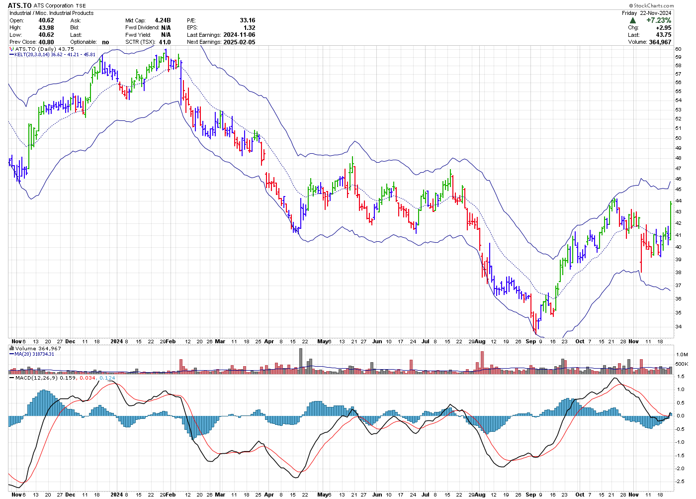
A 1 year daily OHLC stock chart of ATS Corporation (ATS.TO), which is traded on the Toronto Stock Exchange (TSX), is shown below.
Chart courtesy of Stockcharts.com

On this chart, there are 3 indicators. The price bars in this price chart are coloured using the Elder Impulse system which is described in Alexander Elder's book The New Trading for a Living. Overlayed on the price chart is shown a Keltner channel. Underneath the price is the volume pattern and below the volume is the full moving average convergence and divergence (MACD) indicator.
From a bullish perspective, Elder's coloured bars can be briefly summarized as follows: red, don't buy. Blue bars give you a choice and green bars can be bought. The bars are coloured based on the MACD and moving averages he uses.
This Keltner channel shows the 20 EMA as a thinner light coloured line in the middle of the price bars while the outer solid lines are the 3 times the 14 period average true range ATR(14) added to and subtracted from the 20 EMA. This EMA is a trending indicator and as such lags the market. When price hits the upper channel this can be a good time to take partial profits as price does not typically stay at these levels for very long before reversing.
Just below the price chart is the volume (black and red lines) that the stock is trading each day. You can see that every once in awhile, the volume will spike up. In some cases these spikes appear to be at turning points while at others times they appear random.
MACD Histogram Indicator
The bottom histogram is the moving average convergence and divergence (MACD) indicator. It can be divided into two parts: the histogram (blue histogram at the bottom of the chart) and the lines (black and red) at the bottom of the chart.
The MACD lines consist of two lines. The first line (black) is
the difference between the 12 and 26 day EMA of price while the red line
is the 9 day moving average of this line. Some traders will use the
crossing of these two lines as buy and sell signals. As they are
dependant on moving averages, these signals would be considered lagging.
The histogram measures the differences between the 12 and 26 day EMA (black line) and the 9 period moving average of this line (red line). A divergence between the histogram and stock price indicates there is a potential for a reversal in the stock price.
For
instance, there is a divergence between the the high which occurred on
the left hand of the chart and the MACD histogram. Soon after the stock
dropped. Also, the lows seen on the right hand side of the chart shows a
MACD histogram divergence as well. Soon after, the stock made a $10
move from around $34 to $44.
Price should generally be used to confirm any stock market indicator.
A good book, which I refer to often to learn about indicators, is Steven B. Achelis's, "Technical Analysis from A to Z"
Gifts for Stock Traders - Stock traders are a different breed. For the stock trader in your life or as a present to yourself consider getting a trading mug. This can be used throughout the day to sip on your favourite beverage and remind you that you are a trader.
Monte Carlo Simulator
for Traders
 Having troubles sticking with your trading system?
Do you move from system to system looking for the one system that will bring you riches?
Perhaps you already have it and tossed it aside when it went into a down period.
Using this Excel based program will show you what you can expect out of your trading system once you know the % wins and profit factor.
Stop wasting your time searching for the perfect system (which does not exist) and start trading.
$20.00


